Conceptual photography, at its core, is about communicating a message, an idea, a theme or a story. To convey a concept in a single frame, the artist has to consider every step from planning to shooting and editing, so that each element in the image is purposeful and cohesive.
To illustrate this point, I wanted to break down one of my conceptual self-portraits, to go behind the scenes and really dig into the creative process from idea to completed image.
The concept
A concept can be any idea that you want to explore – it can be a statement on something you believe in, a story you want to tell or communication of an emotion or feeling that you want the viewer to experience.
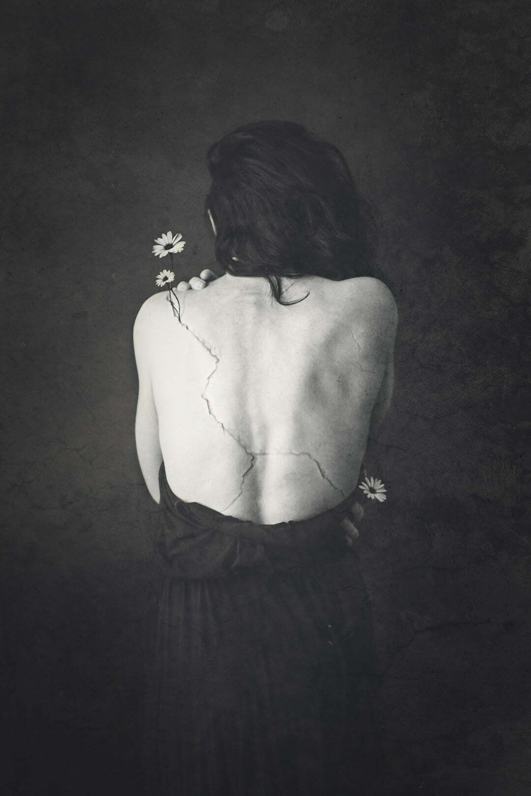
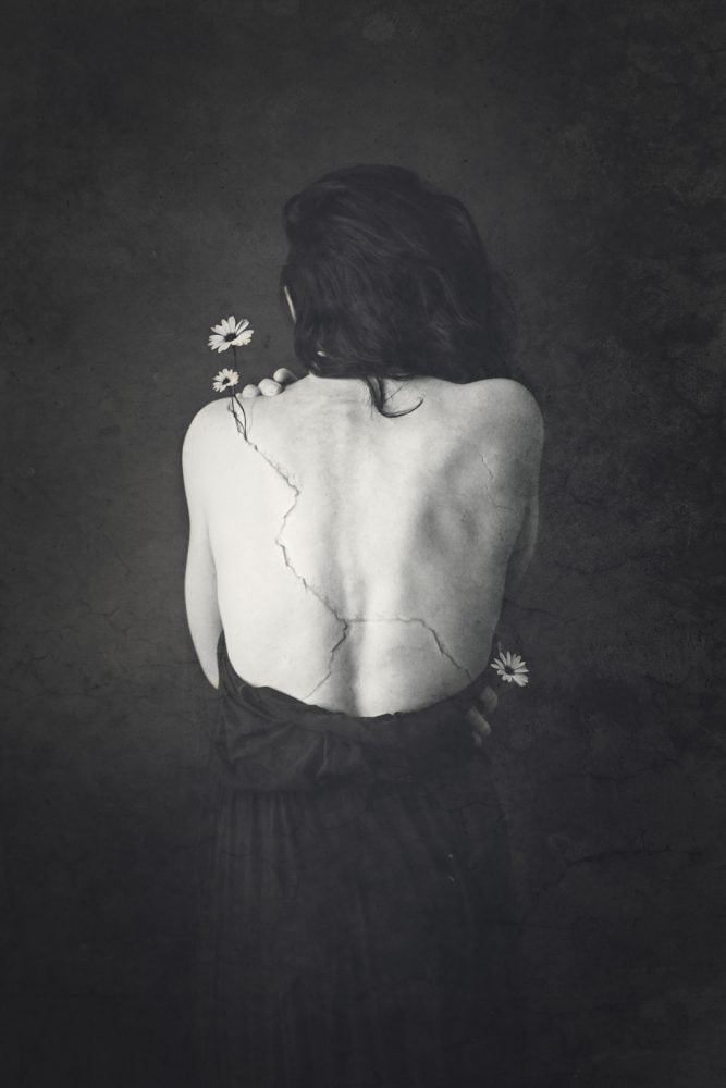
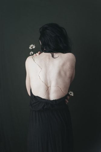
In this image, I wanted to explore the idea of our imperfections – the ways we are flawed, damaged or broken but also that good and beautiful things can grow from the cracks.
Planning the shoot
There are a number of components that need to be considered in shooting a conceptual self-portrait including pose, wardrobe, location, lighting and props as well what post-production techniques will be used plus any additional elements that need to be captured.
Pose
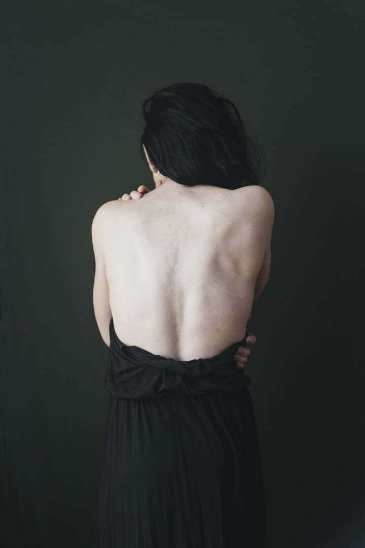
I wanted the pose to be very intentional – the subject in this story is revealing her cracks and I wanted the sense that she was deliberately presenting them to the viewer. The pose needed to be strong but also include softer and more delicate details. For the more practical elements of the concept there needed to be skin that the cracks could be added to and I knew I wanted the cracks and flowers to start near the top left shoulder so I deliberately placed my hand there to further direct the eye. Shooting from the back also naturally obscured my face – keeping a sense of anonymity in conceptual images can help the viewer put themselves into the story, creating a stronger connection to your message.
Wardrobe
The wardrobe wasn’t an essential part of the concept so I chose a dress that was neutral and didn’t have any distracting details that would draw the eye away.
Location
I chose to shoot this in a very traditional portrait style. A posed and styled portrait shoot is intentional, the subject is conscious they are being photographed as opposed to being unaware of the camera. The backdrop was a piece of fabric pinned to a wall – I chose a darker colour but not black, so my dark hair would still have some separation from the background.
Lighting
I shot with side light because I wanted to enhance the texture and shape of the back through the natural shadows. The light source was a window, diffused through sheer curtains.
Props
I knew for the edit I had in mind that the flowers would need to be shot separately. I had stock images of flowers I had shot for a previous image that I knew would work for this because they were shot on a very similar dark background with the same side lighting conditions so they would be consistent with the main image. I also used an image of a cracked wall that I had shot previously – I knew that this would be mostly blended into the skin so the fact that it was shot in a completely different location was less of an issue.
I have another post here on how I shoot self-portraits including shooting tethered so I can see the frame and using a remote on a timer.
Below is the main shot used as well as the flowers and crack.
Editing
This image went through 3 distinctive editing stages – initial compositing to create the image base, compositing in additional elements and finishing up with colour, texture and lighting changes to the overall image.
Initial compositing
I chose the main shot because it had the most elements in place, then added small details from other shots to enhance this.
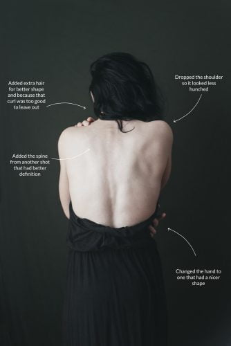
Compositing the flowers and cracks
The cracks were added in parts to create the shape I wanted, leading down from the top shoulder and across the back and blended using the Overlay blend mode and layer masks. The flowers were then positioned and cut out using layer masks – because they had been shot on a dark background they blended more easily where they hit the backdrop so they didn’t need to be cut around so precisely. The flowers also had adjustment layers clipped to them to add shadows where they would naturally occur if they had been shot as part of the original image.
Texture, colour, lighting and contrast
Once the compositing was complete, I could move on to making overall changes to the image.
I added 2 separate textures, both in Soft Light blending mode. The textures were both photos of gritty and cracked walls to add to the cracked and flawed feel of the image. I chose to apply the textures over the whole image and not just the background because I wanted to include a subtle layer of meaning – that sometimes flaws are in the way we perceive things, not necessarily how they actually are.
Removing the colour from the image allowed to focus to really be on the texture and tones, while also adding an aged portrait feel. The black and white colouring was achieved using a gradient map, allowing me to apply different shades of black, white and grey to the shadows, highlights and midtones of the image. This also allowed me to reduce the contrast, giving a softer feel. There is some additional subtle colour toning applied over the black and white layer, adding blue to the shadows and a small amount of yellow and red to the highlights – this is something I do in most of my images to create natural softness and warmth.
Finally, overall lighting changes were made, adding a vignette around the edges, lightening the hair slightly and adding a little more contrast to the subject to draw the eye inwards.
Before and After
